For more than a decade, Pantone's Colour of the Year declarations have influenced product development and purchasing decisions in multiple industries including home design. This year's Pantone colour is.....
Another quiet pink combination that works well for relaxation. The pink/ brown combination is one of my favourites and recently it is a popular colour scheme for children's rooms.
Pantone Colour Institute Executive Director Leatrice Eiseman says, "In times of stress, we need something to lift our spirits. Honeysuckle is a captivating, stimulating colour that gets the adrenaline going-- perfect to ward off the blues." Yes indeed, Honeysuckle is that kind of pink, but there are many tints and shade of pink that are options in decor.Perhaps there's one for you.
source
Vibrant all the way. You couldn't help but feel upbeat in this room. Some rooms have so much colour energy they are difficult places to relax. Personally, I love a room that soothes and this space would not be my first choice. How about you?
A subtle and understated pink creeps quietly into this decor and settles in place. It produces a quiet, relaxed environment that calls you to curl up with a nice book.
Another quiet pink combination that works well for relaxation. The pink/ brown combination is one of my favourites and recently it is a popular colour scheme for children's rooms.
source
Anything with gray is bound to be a favourite with me. I love the way grays are the supporting actors in a room , letting other colours do their thing. Gray is the new neutral, but it has been my neutral since the mid 80"s
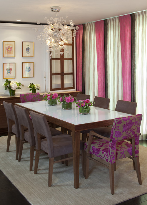
I love the chairs. Enough said.
This room combines two 2011 trends, honeysuckle and pattern.
What's your tolerance level for pink in decor?
Anything with gray is bound to be a favourite with me. I love the way grays are the supporting actors in a room , letting other colours do their thing. Gray is the new neutral, but it has been my neutral since the mid 80"s
tineke triggs
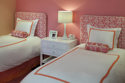
Orange and pink are a somewhat unlikely pair, but they work well together especially when one dominates.
Orange and pink are a somewhat unlikely pair, but they work well together especially when one dominates.
Oatmeal and pink which is moving subtly toward coral makes a fantastic duo in this Sarah Richardson design.
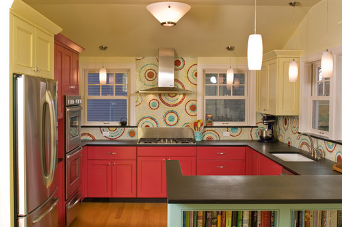
Yellow is another colour that you don't often see paired with pink, but it is one of my favourite combinations. The addition of orange makes this an energetic combo without being too much so because of the light colour on the walls. If I could make one change in this room, I would paint the walls a more neutral colour.
I love the chairs. Enough said.
This room combines two 2011 trends, honeysuckle and pattern.
What's your tolerance level for pink in decor?
You have read this articlecolour schemes /
cream /
pink
with the title Think pink in 2011. You can bookmark this page URL http://emilysbreakfast.blogspot.com/2011/01/think-pink-in-2011.html. Thanks!
Write by:
Unknown - Tuesday, January 4, 2011


Comments "Think pink in 2011"
Post a Comment