Art warms a home, makes it interesting, provides topics for conversation and contemplation , adds colour, the list goes on indefinitely. There are various ways to display art; some are more successful than others. One option is leaning art against a wall rather than hanging it, but this display option isn't always successful for a variety of reasons. If you want to try leaning art, consider the following factors.
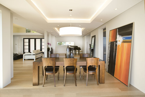
When you want to lean work on the floor it needs to be large enough to observe from standing position and bold in imagery so it can be read at a distance. Even the dog get this!
The photo on the right works better than the the art to the left of it because the image is tiny.
The boldness and simplicity of this painting make viewing it easier when leaned on the floor. The objects in front of it enhance the placement and help to anchor it safely. They do not interfere with the reading of the image. Which leads to the next guideline...
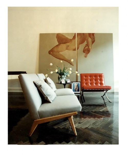
Layering other objects in front of an artwork is a tricky business. This vignette is successful because the image is large, dark and has quite a bit of space where there are no details. The chair and table lie in areas without too much detail. You don't feel as if you are missing important elements of the work.
Layering art on shelves, consoles, and mantles can be very interesting. It is a way to display smaller pieces to good advantage. While this is a very simple vignette with the branch acting as a consolidating element, it is possible to have more complex collections of objects.
There are lots of small pieces in this display but they read as one unit because of the colour cohesiveness.
1. Scale - Choose artwork large enough to read from standing or sitting position
 |
The size of a piece of art in comparison to the space and objects around it usually determines successful placement. This painting fits the bill perfectly.
 |
| Large scale images work best source |
The photo on the right works better than the the art to the left of it because the image is tiny.
Perfect scale and beautiful work that can still be seen and read while sitting or from other areas of the room.
 |
| Bold form and simple composition source |
2. Layering: Don't cover major parts of an artwork
 |
| Successful layering source |
 |
| Do you want to remove anything here? source |
There are so many things about this vignette I love, but I want to see all of the artwork and part is hidden by the table and books. Even removing the books would help things considerably. Love the candlesticks and the table, both really work with the artwork.
 |
| Successful layering where each image is clearly seen. source |
3. Colour scheme: Restrict colour combinations in leaning gallery display
 |
| Limited colour scheme provides cohesion |
4. Image: Choose the right image for the space
I think the work that layers best in a vignette has bold form and colour. It can compete with the other objects for your viewing attention.
Now it's your turn. What do you think of this arrangement?
You have read this articleart arrangement
with the title Leaning art: 4 Guidelines to make it work. You can bookmark this page URL http://emilysbreakfast.blogspot.com/2014/01/leaning-art-4-guidelines-to-make-it-work.html. Thanks!
Write by:
Unknown - Sunday, January 26, 2014


Comments "Leaning art: 4 Guidelines to make it work"
Post a Comment